How to make a responsive navigation menu

I am a Frontend developer with 3+ years of professional experience in the React.js, Next.js, and Typescript ecosystem. I have developed a strong skillset in writing beautiful and functional user interfaces. My expertise also extends creating visually appealing designs using raw CSS and frameworks like TailwindCSS.
Introduction
This series will be called "Web Snippets" and it will cover how to build basic portions of a website using HTML and CSS for beginner web developers. It will range from simple elements like buttons and forms to more complex components such as carousels and modals. The components built will encapsulate a particular functionality or design element and can be easily integrated into different projects without requiring extensive coding knowledge but they will also serve as a guide to help beginners build more advanced versions on their own. Let's begin
Creating the navigation menu
As mentioned earlier, we will be building the majority of the components out with HTML and CSS, we may also write a little JavaScript to help add some functionality where it is needed.
The HTML Set up
We will set up the basic page markup for our HTML page.
<!DOCTYPE html>
<html lang="en">
<head>
    <meta name="viewport" content="width=device-width, initial-scale=1.0,minimum-scale=1">
    <link rel="stylesheet" href="style.css">
    <title>Document</title>
</head>
<body>
    <!-- The rest of the markup goes here -->
</body>
</html>
The only new information in the snippet above is<meta name="viewport" content="width=device-width, initial-scale=1.0,minimum-scale=1">.
Let's break down the attributes within the <meta> tag:
name="viewport": This attribute specifies that we are defining the viewport settings.content="width=device-width, initial-scale=1.0, minimum-scale=1": This attribute determines the actual configuration of the viewport and consists of three important properties:width=device-width: This property sets the width of the viewport to the device width. It ensures that the content on the web page adapts to the screen width of the device, allowing it to be displayed correctly without any horizontal scrolling.initial-scale=1.0: This property sets the initial zoom level when the page is first loaded. A value of1.0indicates that the initial zoom level is set to 100%, meaning the web page is displayed at its original size.minimum-scale=1: This property specifies the minimum allowed zoom level. By setting it to1, we prevent the user from zooming out and maintaining a consistent and legible layout.
We also added a link to our external stylesheet (learn more)<link rel="stylesheet" href="style.css">
This is where we will add our styles later on.
The HTML markup for our Navigation menu
<!DOCTYPE html>
<html lang="en">
<head>
    <meta name="viewport" content="width=device-width, initial-scale=1.0,minimum-scale=1">
    <link rel="stylesheet" href="style.css">
    <title>Document</title>
</head>
<body>
    <nav>
      <!--  This is the button to toggele the menu on mobile devices  -->
      <div id="hamburger">
        <div id="bar1"></div>
        <div id="bar2"></div>
        <div id="bar3"></div>
      </div>

      <!-- This is the list of menu items   -->
      <div class="navMenu">
        <ul>
          <li>Skills</li>
          <li>Portfolio</li>
          <li>Services</li>
          <li>Contact</li>
          <li>Resume</li>
        </ul>
      </div>
    </nav>
</body>
</html>
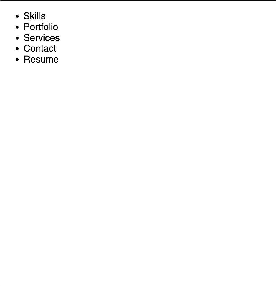
In the snippet above, we added a nav that will contain the content of our navigation menu. It contains a div with an id="hamburger" that will serve as our hamburger menu icon on mobile devices and a div with a class="navMenu" that will contain our menu items.
At this point, our project should look like this
Now onto CSS.
The CSS styling for our nav menu
Recall we linked our CSS file style.css externally. In that file, add the following:
* {
  margin: 0;
  padding: 0;
  box-sizing: border-box;
}

/* Hide the menu to the side on mobile and not allow scrolling to the side */
html {
  overflow-x: hidden;
}

/* basic styles for the header component */
nav {
  width: 100%;
  padding: 20px;
}
These are the base styles and are pretty self-explanatory in this case. Read the comments for any further clarification.
Styling the menu Items
/* Make nav menu items take full width allocated */
.navMenu ul {
  display: flex;
  justify-content: space-between;
}

.navMenu li {
  list-style: none;
  font-size: 1em;
  text-transform: uppercase;
  font-weight: 500;
  cursor: pointer;
}

.navMenu li:hover {
  color: blue;
}
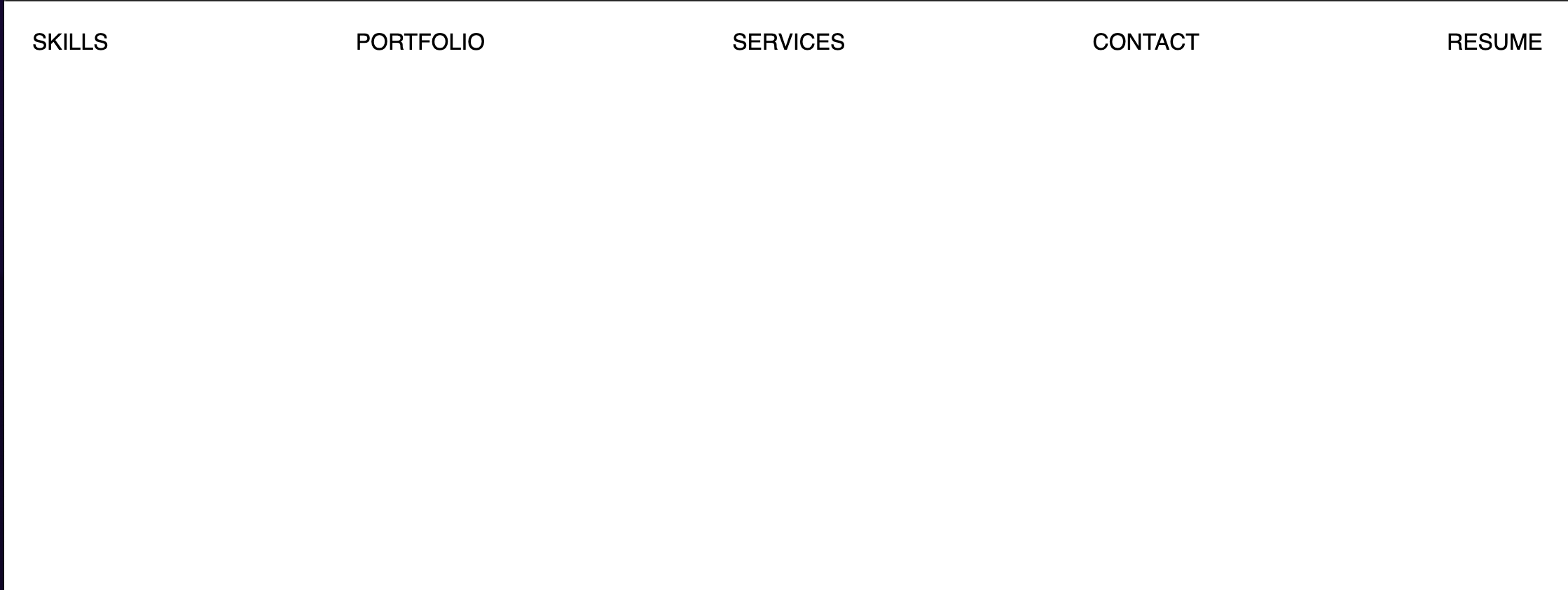
We made use of flex-box to make the menu take the full width available on the page, we also added a hover state on the list items to give them a color of blue on hover.
At this point, our project should look like:
Styling the Hamburger menu icon
/* Styles for the hamburger menu icon */
#hamburger {
  display: flex;
  flex-direction: column;
  align-items: center;
  justify-content: center;
  cursor: pointer;
  position: absolute;
  top: 20px;
  right: 20px;
  z-index: 10;
}

#hamburger div {
  width: 22px;
  height: 2px;
  background-color: black;
  margin: 4px 0;
  transition: 0.5s;
}

#hamburger {
  display: none;
}
These styles are for us to create the Hamburger Icon but we set them to display: none to hide them by default. We will adjust that on our mobile styles.
Styling for Mobile
We will use media queries to target devices that are less than 768px in width (mobile devices and small tablets)
@media screen and (max-width: 768px) {
  #hamburger {
    display: block;
  }

  .navMenu {
    position: absolute;
    top: 0;
    right: 0;
    width: 100%;
    height: 100%;
    background-color: black;
    transform: translateX(100%);
    transition: 0.5s;
  }

  .navMenu ul {
    width: 100%;
    display: flex;
    flex-direction: column;
    align-items: center;
    margin: 15px 0;
  }

  .navMenu li {
    color: white;
    padding: 15px 0;
  }
}
On mobile devices, we will display the hamburger menu icon and change the layout of our menu to take up the full width of the screen but we will put it off to the side to begin (we will later bring it in with JavaScript).
At this point only our hamburger icon should be visible on mobile screen:

Adding the Utility classes for Javascript
/* Extra utility classes to be added with JS */
.nav-active {
  transform: translateX(0);
}

#hamburger.toggle div {
  background-color: white;
}

.toggle #bar1 {
  transform: rotate(-45deg) translate(-5px, 4px);
}

.toggle #bar2 {
  opacity: 0;
}

.toggle #bar3 {
  transform: rotate(45deg) translate(-5px, -4px);
}
These styles are to cover the hamburger menu animation when it is clicked and add the nav-active class which reveals the menu.
Writing the Javascript
Finally, we will add the JS code that will make it all interactive
// select the things we need form the DOM
var hamburger = document.querySelector("#hamburger");
var nav = document.querySelector(".navMenu");
var navLinks = document.querySelectorAll(".navMenu li");
We need three things:
To toggle the menu visibility when we click the hamburger menu
To animate the hamburger menu when we click on it
To close the menu when we click on an item in the menu
We can handle the first two by adding this snippet:
// toggle nav on click of hamburger menu icon
hamburger.addEventListener("click", () => {
  nav.classList.toggle("nav-active");

  // burger animation
  hamburger.classList.toggle("toggle");
});
Finally, to close the menu when we click on on item in the menu:
// close nav by clicking on list items
Array.from(navLinks).forEach((li) =>
  li.addEventListener("click", () => {
    if (hamburger.classList.contains("toggle")) {
      hamburger.classList.remove("toggle");
    }
    if (nav.classList.contains("nav-active")) {
      nav.classList.remove("nav-active");
    }
  })
);
With all of this, we should have a fully functional and responsive navigation menu. You can check out a live demo below or here:
Try to adjust the size of the window to test the responsiveness.
Conclusion
Creating a responsive navigation menu is not a very complex task and it can be done with HTML, CSS and a few lines of JavaScript. Make sure you try to recreate it on your own.
If you would like to share your creations tag me on Twitter (@pauloe_me)


