How to Test and Debug Your Responsive Website Across Different Devices and Screen Sizes

I am a Frontend developer with 3+ years of professional experience in the React.js, Next.js, and Typescript ecosystem. I have developed a strong skillset in writing beautiful and functional user interfaces. My expertise also extends creating visually appealing designs using raw CSS and frameworks like TailwindCSS.
Testing and debugging your responsive website across different devices and screen sizes is crucial for ensuring that your website looks and functions correctly for all users. Here are some tips and tools to help you test and debug your responsive website.
Use Responsive Design Testing Tools
There are several tools available online that can help you test your responsive website across different devices and screen sizes. These tools allow you to see how your website looks on different devices without actually having to own all of them. Here are a few popular responsive design testing tools:
Google Chrome DevTools [Preferred choice]
Google Chrome DevTools is a built-in developer tool that allows you to test your website on different devices and screen sizes.
Here are a few steps to access the Chrome DevTools:
Open the website you want to test in Chrome
Right-click on the page and click on inspect or press
F12on your keyboard
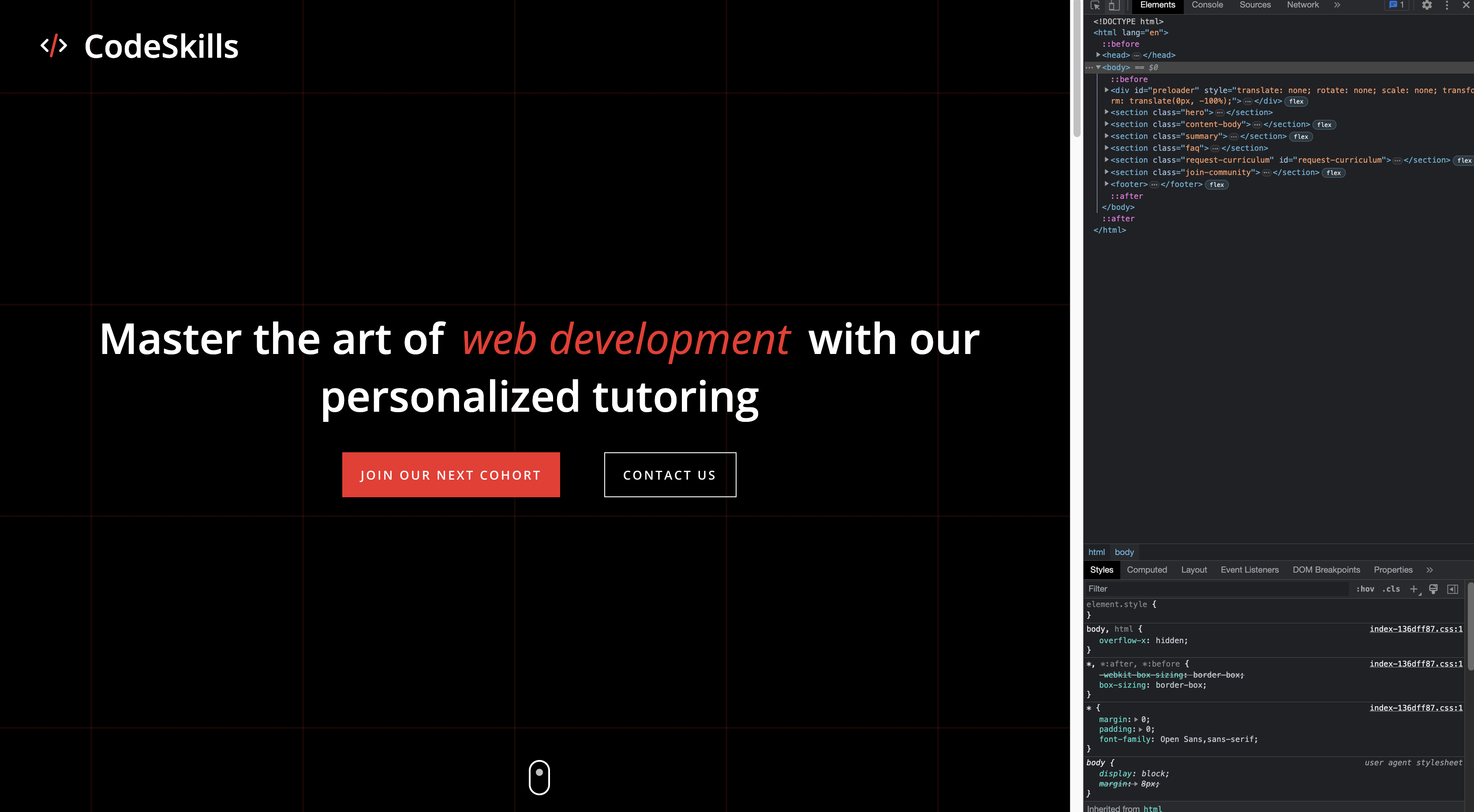
The dev tools will open up on your screen.
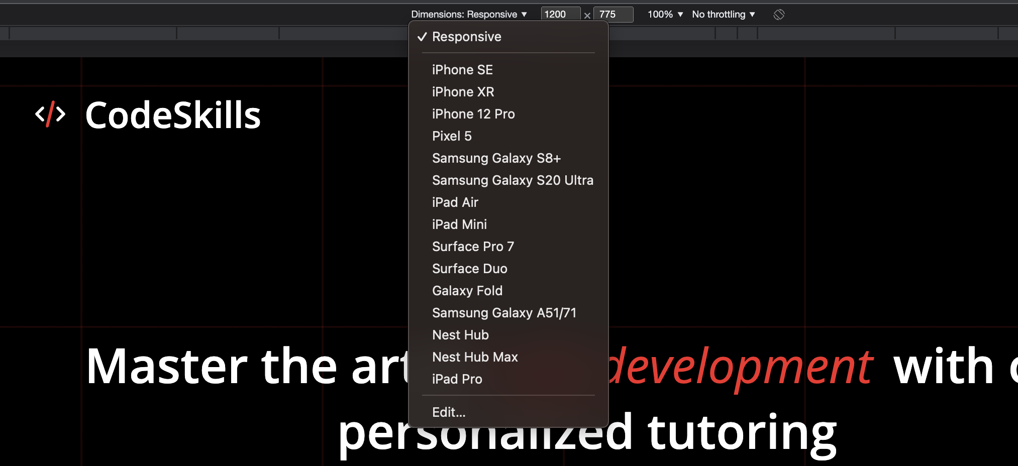
On the top-left of the dev tools, click on the icon that looks like two devices stacked on or press
Ctrl/Cmd + Shift + Mon your keyboard. That will open up the device toolbar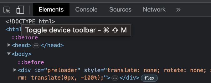
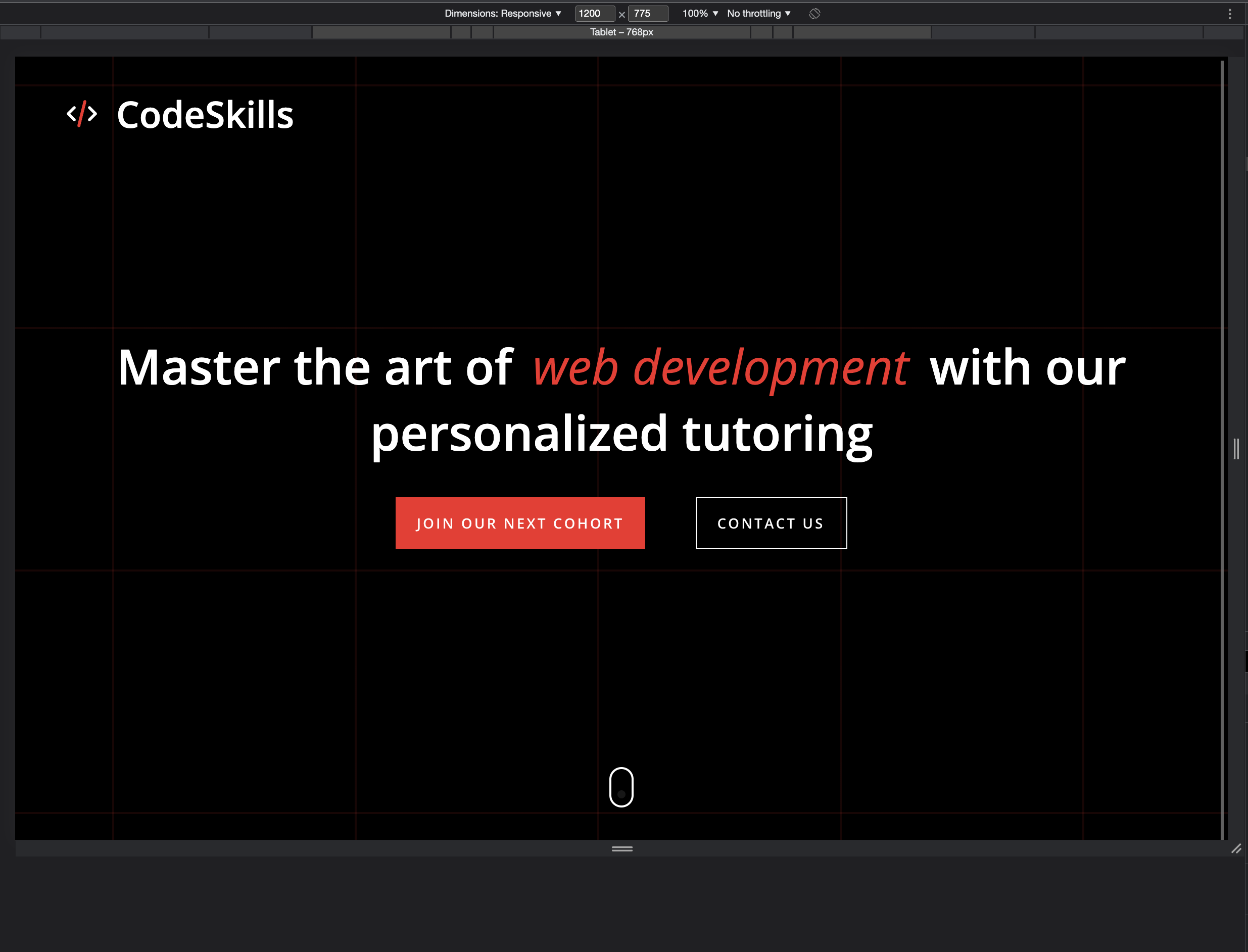
Select a device from the device dropdown in the device toolbar, and it will change to show you how the website will look on that device
In the example, I selected
iPhone 12 Pro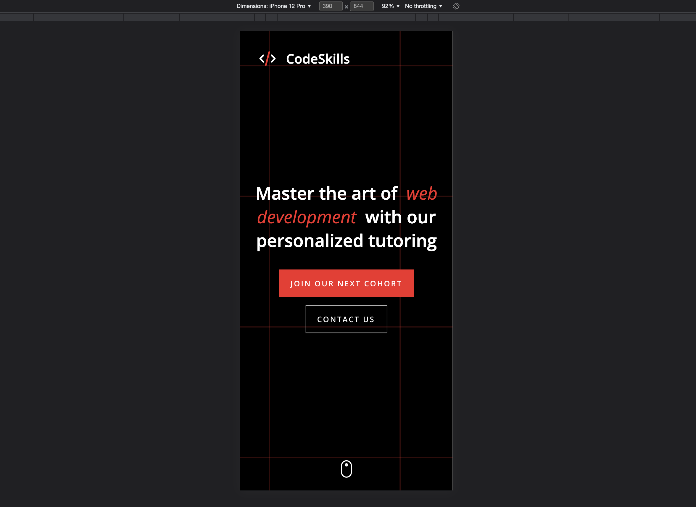
After inspecting, you can close the dev tools by clicking on the close
Xbutton at the top-right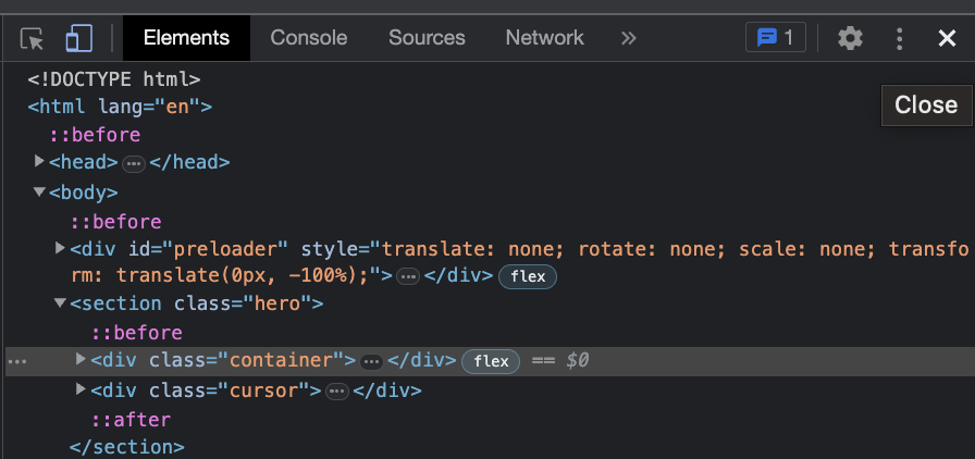
Other Methods
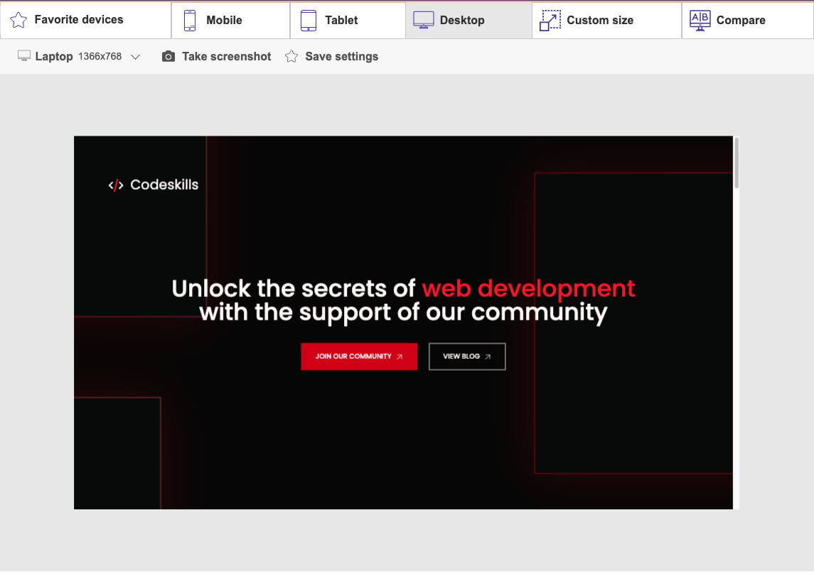
WebsitePlanet: This is a valuable tool that allows you to test how your website looks and functions on various devices and screen sizes. It's interactive, which means you can experience your website on the same device you're testing, giving you a sense of what your users will experience.
Give it a try here: https://www.websiteplanet.com/webtools/responsive-checker/
BrowserStack: BrowserStack is a popular cross-browser testing tool that allows you to test your website on different devices and browsers.
Learn more: https://www.browserstack.com/responsiveTest on Real Devices
While responsive design testing tools can be helpful, it's also important to test your website on real devices whenever possible. This will give you the most accurate representation of how your website looks and functions on different devices and screen sizes. Here are a few tips for testing on real devices:
Use a Device Lab: A device lab is a collection of devices that you can use for testing your website. You can set up your device lab (If you have $$) or use a third-party service like BrowserStack (https://www.browserstack.com/responsive).
Use Remote Debugging: Many browsers, like Google Chrome and Safari, offer remote debugging tools that allow you to debug your website on a real device from your computer.
Learn more: https://developer.chrome.com/docs/devtools/remote-debugging/
Get Feedback from Real Users: Getting feedback from real users is a great way to identify issues with your website that you might have missed during testing.
Conclusion
Testing and debugging your responsive website across different devices and screen sizes is crucial for ensuring that your website looks and functions correctly for all users. By using responsive design testing tools, and testing on real devices, you can identify and fix issues before they impact your users. Remember to test your website regularly and make adjustments as necessary to ensure that it continues to perform well over time.
What's next?
In the coming article, we will be covering an introduction to CSS animations and transitions. Don't forget to follow and share this with your friends that are just starting their web development journey.


